Showing posts with label case study. Show all posts

Tuesday, October 9, 2012

Designers & Dragons Masthead Redesign and Icon Design [Logo Process | Case Study]

Designers & Dragons Before AfterDesigners & Dragons IconsEvil Hat Productions just announced that they'll be re-publishing Designers & Dragons, Shannon Appelcline's epic history of the role-playing game industry and community. They're going to expand the book into four volumes, each volume focusing on the events of on decade from the 70s through the 00s. Fred Hicks asked me to revise the masthead and create a system of icons representative of each decade of gaming.


MASTHEAD

This one was tough because we didn't want to stray too far into WotC's official branding and we needed to communicate "designers" as much as "dragons." The usual solution would have been to make each word a different font, as the original title had done. I explored that solution at first, just to get it out of my system, but as you can see from the design process below, we eventually landed on a more refined typographic solution. The slides below are actual pages from the design docs I sent to Fred.

Round 1

"Essentially the same idea as the original Designers & Dragons masthead, but much more refined. This update pairs the very contemporary Gotham with classic D&D font Fritz Quadrata. The ampersand fuses with the second D to become a smaller mark.

Or maybe you want to go full Fritz Quadrata...
...or all Gotham.
Perhaps something a little more formal and unified, if a little prudish. Trajan being a very stalwart “title font” for damn near everything, but particularly apropos on a history book.
Jenson has a slightly more aged, humanist feel.
Maybe we can try a very high-design approach here, pairing Bodoni and Carton, with a Bodoni italic ampersand lying firmly outside the rectangle. The organic curves of that ampersand make it a natural place for a light touch of the draconica, without going full-on TSR with it."


Round 2
"Continuing with the exploration of various Bodoni styles for “Designers” and arranging the various elements. Also using Diavlo for  “Dragons”
Maybe lowercase? It seems a little too busy and the swoops compete with Diavlo.
Two-tone to distinguish each half of the title?
Or go all the same? Probably room for a middle-ground. Also not sure if the Bodoni Italic is holding up well in this phase. Might need to choose another font.
Maybe make the whole thing Diavlo? The lowercase g’s would be right on top of each other, so I converted an uppercase G to be small caps. Hopefully it’s not too noticeable.
That’s definitely holding up better than Bodoni. What do you think?"


Round 3
"This time around, we’re equalizing the priority of “Designers” and “Dragons.” As noted in the last round, these are odd words to stack at equal weight because of the matching descenders in the g’s. Moving the ampersand down to the second line might help nudge the words off-center so they’re less crowded.
For the sake of curiosity, let’s try the title using the same typeface as the original ampersand font: Bodoni Bold Italic (&). Very classy and respectable. If we go this direction, I would recommend not adding a bunch of superfluous textures. A white title on a cover could be a slightly more professional direction.
For example...
Thoughts?"

Well, Fred liked it! So we proceeded to the icon design.


ICONS
Each volume focuses on a different decade of gaming, each with distinctive events that changed the nature of the industry. The 70s were the origin of RPGs as we know them, led by the earliest editions of Dungeons & Dragons. The 80s were the industry's adolescence and Cyberpunk was the flavor du jour. The 90s saw the rise of Vampire: The Masquerade and Magic: The Gathering, we decided to focus on Vampire. And in the 00s, the d20 license encouraged dozens of small studios to release their own products.

Round 4

"We’re going with this as the masthead, so let’s look at some icon options. These will be used in full-color online and on marketing materials. Smaller black-and-white dingbats will be used in in-line text. I focused on one icon for each decade – 70s: Sword, 80s: Chip, 90s: Ankh, 00s: d20.

The “fancy: icon suite in black-and-white: The icons remain flat, but have a few touches to suggest dimension. The type is subtle, but clear. The background arrows flow into each other, capped at the beginning and end with flat sides.
 Color versions of the “fancy” icon. Tried to keep them generally monochromatic, but keeping the same shade qualities throughout.

The smaller dingbat versions of the icons in color and black and white. The interior details of each icon have been removed, along with the banners and text. The spokes of the circuit had to be slightly extended so they were clearly visible. The d20 doesn’t hold up as well in this treatment, ending up looking either like a hex or a cube (which are still related to gaming, but not specifically to this decade).

Cover and Spine Mockups."


Round 5
The changes from here on were mostly cosmetic, hence the repeated captions.


Round 6


Adding a handful of circular dingbats to the suite.

And you can see the final results at the top of this post! Hope you dig them. You can find out more about the books and follow their development at the Designers & Dragons product page!


Monday, September 24, 2012

Board Raptor Games Logo Design

Board Raptor Games Logo
Jenn Rodgers, J.R. Blackwell and the rest of the Velociraptor! Cannibalism! team have a name: Board Raptor Games. Yay! Buuuuut they needed a logo!

They were nice enough to ask me to do the honors. Hard to tell from this is early sketch, but I had a clear outline of where to take the logo. I was taking a little inspiration from the Philosoraptor meme for posing, but I didn't want to resemble on that image too closely. I thought, "Hm. What if he was holding a headless meeple? What if he had a board on his head?"

Neither of those really worked as well as the raptor's distinctive silhouette standing on its own. But surely this guy needed *some* kind of clear mark that called to his origins. Then I looked back at the original V!C! Kickstarter. Lo and behold, the solution. A velociraptor with a monocle. Of course! "Board member" or "Chairman of the board." Spiffy.

With that, it was a super-easy project. Most of the work was done in one weekend thanks to a very responsive client. Thanks, Board Raptor! Hope you like your logo!

» More about Velociraptor! Cannibalism! 

Friday, August 10, 2012

School Daze!


Several months ago, Tracy Barnett tapped me to do layout on his new John Hughes/high school RPG School Daze. I'm happy to announce that the layout is done and this baby is off to print. Brian Patterson did the illustrations.

Because this would be primarily a PDF product, with options for POD printing, I wasn't so scared of going full-color edge-to-edge. I pulled a bunch of idle high school doodles into the background elements and channeled my inner 90s kid with some of the header treatments. Hopefully I don't date myself too much with this design, though.

Mainly I wanted to make a nice showcase for Brian Patterson's art. He's got a great style that's developing into something really special. And holy crap is he fast! There are literally dozens of unique headshot portraits he had to draw to spec in just a week, but sure enough he pulled them out. Really good job there.

Elizabeth Bauman edited the text, making sure everything made a lick of sense. Designers, you ned editors. Beleive me on this on.

Check out the preview spreads above and find out more about School Daze.

Monday, June 4, 2012

Third Degree Custom Business Cards

Third-Degree-Advertising---Business-Cards
Just wanted to share these really quick. I helped redesign my agency's business cards. We only have a few people in the agency who need lots of business cards, but we had been in the habit of printing hundreds of cards for everyone.

In the new system, we have kraft chipboard shells with generic information for our two offices. You check the box for your office and fill in the space for your extension. Each employee has a custom printed sticker to fit onto the card. When we get a new hire or promotion, we can just print new stickers instead of whole new cards.

Apparently these cards were a big hit at a conference recently. In an environment where attendees are swarmed with free trinkets, they were coming to our booth specifically for our business cards. Neat!

Saturday, February 4, 2012

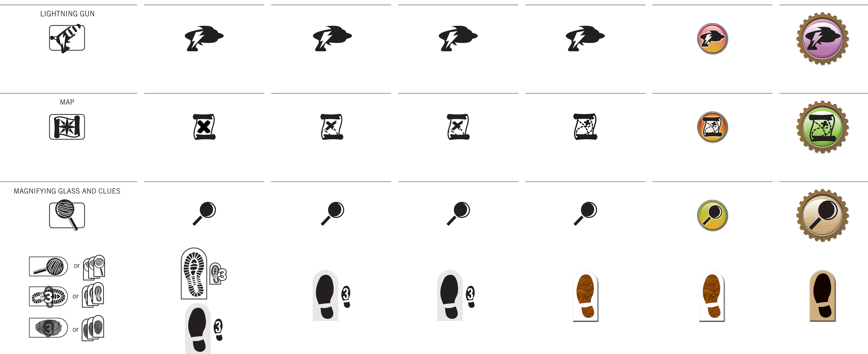
Case Study: Iconography of Race to Adventure


Click the images above to embiggenate! We're wrapping up the final design for the cards in Race to Adventure. You can see a sneak peek at an early draft in this earlier post. I want to give you a light overview of some of the process.


At the top of this post, you can see how the icon language evolved over several rounds. The images from that last post were from around Round 4 or 5. Since then, we got some really useful input from the gamma test team. They're all avid Euro board game players. Since there are long-term international hopes for this game, we wanted a global perspective.


Mostly the direction was to err on the side of minimalism and simplicity, like a Euro or German game. In Euro terms, this seemed to mean no high-texture or three-dimensional rendering anywhere near the icons. We went back and forth on that point for a while. We settled on the side of three-dimensionality, with some constraints. The essential silhouettes of the icons are still clearly visible, but also use color-coding sampled from the actual item card art.


Visualizing movement was another troublesome matter. The biplane moves one space in a cardinal direction, then another space in a cardinal direction. Then, all other players may move one cardinal direction. The earliest rounds were very literal, showing a full spread of potential movement with lines arrayed from a central pawn. When movement could cross borders, as with the jetpack, we literally showed a border around the pawn.


Clearly this becomes problematic in the confined real estate of the average playing card. In each iteration, we became less and less literal for the sake of space constraints and distance-reading. Instead of showing an example playing field, we simply use icons to represent each type of movement. We now use cardinal arrows to communicate each cardinal movement. Those arrows rotate 45ยบ to indicate diagonal movement. When movement can cross borders, we use a separate icon for that.


Thus, you can see how the "words" of this visual language are born. Two orthogonal crossed arrows translate to "Two movements, each in a cardinal direction." The basic syntax filtered out into the rest of the game, too. It was a great experience working with a robust gamma testing process. Definitely looking forward to working on more card games in the future!

P.S. As an added bonus, here's the Pinterest board I pulled together for inspiration way back when the project first began.