Showing posts with label race to adventure. Show all posts

Wednesday, June 27, 2012

Race to Adventure on Kickstarter and the Value of a Good Demo Video


Heyo! Remember when I posted some early previews of the Race to Adventure card designs? I'm happy to announce that the Kickstarter has launched and the game is ready to pre-order! There are so many awesome rewards in this campaign, folks. Pins, patches, expansions... Evil Hat has really outdone itself with some of this stuff.

I really want to draw attention to the awesome demo video they released. Sure, it's become something of a norm to see highly polished promotional videos for successful campaigns. It's quite another thing to see such a well executed demo video for a Kickstarter campaign.

If I was a newcomer to this product, with no exposure to Evil Hat or Spirit of the Century, this video shows several things:

  • It clearly explains the game, first and foremost. That I fully understand the game after watching the video shows that the team has taken good time to fully test and develop it.
  • It shows that the creators have already invested the time and treasure to produce key graphics and art. This isn't absolutely necessary, especially if you're a small, independent developer, but it's still great to see a game that is pretty much complete at launch.
  • It gives me an idea of how to teach this game to my friends who may not have been exposed to any part of this campaign. This is extremely valuable as a marketing tool. When you email your buddies saying "Hey, let's play Race to Adventure at lunch!" you can share this video or just follow its example face-to-face.

I can say from experience that teaching games is one of the harder tasks of game design. You might be a great player, a great designer, or even a great rules-writer, but actually teaching face-to-face or in a video is an entirely different task. Evan, Fred, Jeremy and Paul did a fantastic job here.

Actually, everyone involved in this game has done A+ work and I'm honored to have had a small part in this process. Now, Race to Adventure!

Friday, March 16, 2012

Race to Adventure - Passport Background

Race to Adventure - Passport Back
All week I've been posting charts n' stuff. Figured I'd treat you all to a little something more lush to carry you into the weekend. This is what will be on the back of the passport boards in Race to Adventure. It was just released on the Evil Hat facebook page. They're unveiling more stuff from upcoming projects as they gain more likes. Hint hint.

Saturday, February 4, 2012

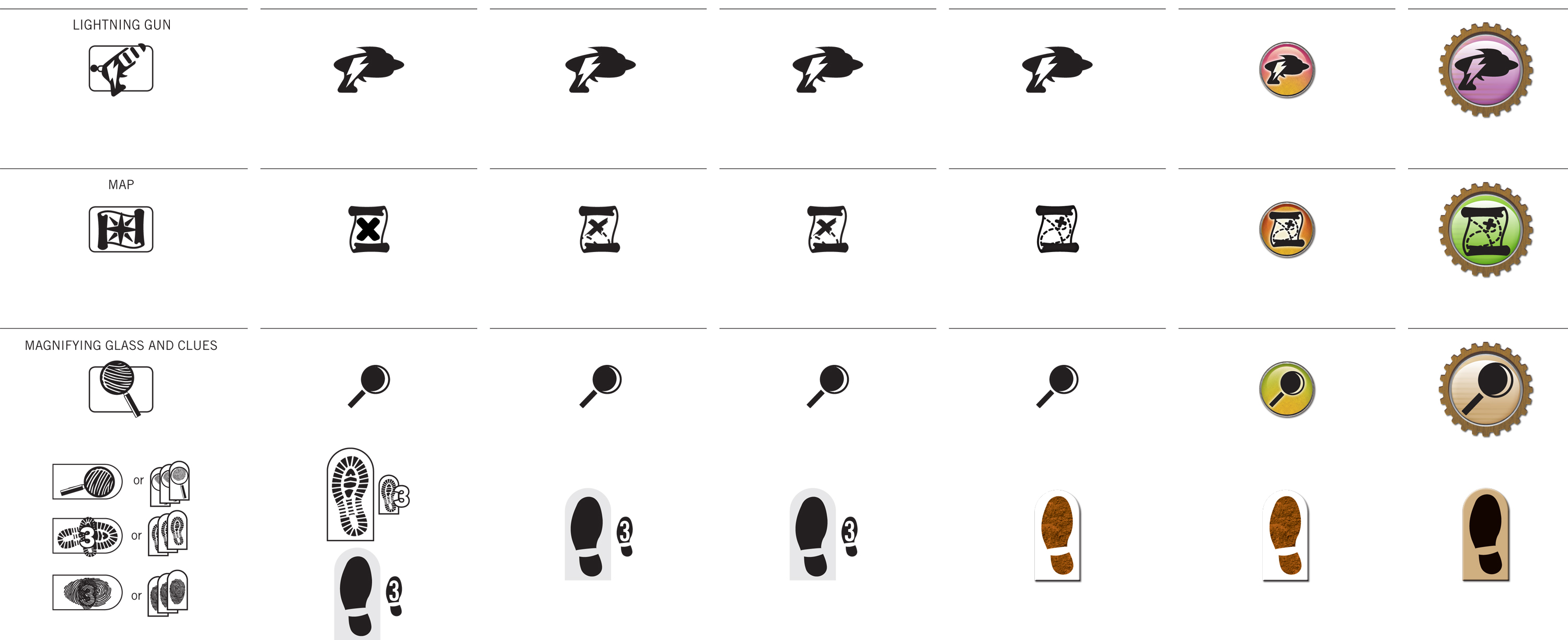
Case Study: Iconography of Race to Adventure


Click the images above to embiggenate! We're wrapping up the final design for the cards in Race to Adventure. You can see a sneak peek at an early draft in this earlier post. I want to give you a light overview of some of the process.


At the top of this post, you can see how the icon language evolved over several rounds. The images from that last post were from around Round 4 or 5. Since then, we got some really useful input from the gamma test team. They're all avid Euro board game players. Since there are long-term international hopes for this game, we wanted a global perspective.


Mostly the direction was to err on the side of minimalism and simplicity, like a Euro or German game. In Euro terms, this seemed to mean no high-texture or three-dimensional rendering anywhere near the icons. We went back and forth on that point for a while. We settled on the side of three-dimensionality, with some constraints. The essential silhouettes of the icons are still clearly visible, but also use color-coding sampled from the actual item card art.


Visualizing movement was another troublesome matter. The biplane moves one space in a cardinal direction, then another space in a cardinal direction. Then, all other players may move one cardinal direction. The earliest rounds were very literal, showing a full spread of potential movement with lines arrayed from a central pawn. When movement could cross borders, as with the jetpack, we literally showed a border around the pawn.


Clearly this becomes problematic in the confined real estate of the average playing card. In each iteration, we became less and less literal for the sake of space constraints and distance-reading. Instead of showing an example playing field, we simply use icons to represent each type of movement. We now use cardinal arrows to communicate each cardinal movement. Those arrows rotate 45ยบ to indicate diagonal movement. When movement can cross borders, we use a separate icon for that.


Thus, you can see how the "words" of this visual language are born. Two orthogonal crossed arrows translate to "Two movements, each in a cardinal direction." The basic syntax filtered out into the rest of the game, too. It was a great experience working with a robust gamma testing process. Definitely looking forward to working on more card games in the future!

P.S. As an added bonus, here's the Pinterest board I pulled together for inspiration way back when the project first began.

Monday, January 2, 2012

Card Layout for Race to Adventure


You've heard me yap on and on about card game design over the past year.

Well, Fred Hicks and Evil Hat finally called me on it and hired me to do the layout for their new card game Race to Adventure, the card game set in the Spirit of the Century universe. It's an action-selection game where you play Centurions traveling around the world via jetpack, biplane and zeppelin for a global scavenger hunt.

The images above are still in-progress, but give you a good sense of the direction we're heading. It's been a very fast process, starting from a week before Christmas up to the designs you see above. We're on-track to finish up the layout by the end of the month. How's that for a quick turnaround?

UPDATE: I neglected to give proper credit to Christian St. Pierre for the illustrations. He's the one responsible for the all the art you see above. I'm doing the backgrounds, frames, iconography, typography and branding. "I do all the visuals the artist doesn't" is what I like to say.