Showing posts with label layout. Show all posts
Wednesday, June 26, 2013
Layout for Heroine Role-Playing Game
A few months ago, Josh Jordan hired me to do the layout on the Heroine RPG books, featuring female heroes in portal fantasy adventures in the spirit of Wizard of Oz and Alice in Wonderland. He also had J.R. Blackwell do the art for the corebook, a series of photos with really cool makeup and a striking on-location setting.
I've done layout on a previous book featuring J.R.'s photography and the challenge is always letting the original photography stand strong on its own without too much ornamentation to distract from it. The layout has to complement the art, not compete with it. Hope I did her work justice!
The second book also used photography, but all pulled from public domain resources in the Library of Congress database.
Check out the slideshow above for the covers and some double-page spreads from the books! If you can't see the slideshow, check out the images below.
Monday, December 24, 2012
InDesign DataMerge Playing Card Example [Free Download]
Happy holidays! This season, I thought I'd give something to anyone interested in designing their own card games. You may recall I posted a hodgepodge collection of tutorials I found regarding the use of InDesign's DataMerge feature to automate much of the card layout process. I plan to make a video tutorial of my own soon, but for now here's a .zip file with a very basic example of a DataMerged deck of playing cards.
Open DataMergeExample.indd in InDesign CS6 or DataMergeExample.idml in older versions of InDesign. You'll find empty text blocks and image blocks. It looks like there's nothing there, but there is! These are placeholders for the text and images that DataMerge pulls from the the .CSV found in the Assets folder. When you check the Preview checkbox in the DataMerge panel, you'll see each of these placeholders populated. (BTW, I just used a default font for Mac: Times, which can be replaced with Times New Roman if you wish.)
/ASSETS
This is also where you will find .EPS files for the suits and face cards. I like to use .EPS for vector files since they can be resized to any scale without losing resolution. So far as I've found, a .CSV is most reliable for DataMerge if it is in the same folder as all of the card assets. Theoretically you can use the .CSV to populate from a deeper directory, but I haven't been able to do so reliably.
/RAW FILES
Here are the InDesign files for the suits and faces, saved in .INDD and .IDML formats.
/RENDERS
I've already exported a DataMerged InDesign file which you can find in the Renders folder. There you will also find a folder with all of *those* cards exported to flat .EPS files. It is from a folder like this that I pull individual card assets for use in example diagrams or print-and-play files.
/STOCK
Here is are the original source files from the Noun Project along with legalese for their specific licenses.
You can also find the original Google spreadsheet here, if you're curious. I hope you find this useful as you design your own card games. If you dig it, I can post some more packages with more complex card decks inspired by CCGs.
Friday, August 10, 2012
School Daze!
Several months ago, Tracy Barnett tapped me to do layout on his new John Hughes/high school RPG School Daze. I'm happy to announce that the layout is done and this baby is off to print. Brian Patterson did the illustrations.
Because this would be primarily a PDF product, with options for POD printing, I wasn't so scared of going full-color edge-to-edge. I pulled a bunch of idle high school doodles into the background elements and channeled my inner 90s kid with some of the header treatments. Hopefully I don't date myself too much with this design, though.
Mainly I wanted to make a nice showcase for Brian Patterson's art. He's got a great style that's developing into something really special. And holy crap is he fast! There are literally dozens of unique headshot portraits he had to draw to spec in just a week, but sure enough he pulled them out. Really good job there.
Elizabeth Bauman edited the text, making sure everything made a lick of sense. Designers, you ned editors. Beleive me on this on.
Check out the preview spreads above and find out more about School Daze.
Sunday, May 27, 2012
Card Designs for Belle of the Ball
| Back of the Guest Cards |
| County: Wineberry. Mood: Chatty. Interest: food. Power: Mingle. Popularity: 2 |
| County: Dundifax. Mood: Flirty. Interest: Music. Power: Mingle. Popularity: -1, +6 if in a group. |
| County: Boarbottom. Mood: Chatty. Interest: Drink. Power: Extra Invite for Richminster. Popularity: 0, +2 if in a group with a Boarbottom. |
| Drink Ribbon: Awarded to the player who has the most guests with Interest: Drink. |
| Back of the Belle Card |
| Belle Bonus: Have the most guests from County: Crawhole. |
| Belle Bonus: Have the lowest Popularity before any Friend Bonuses. |
Above is a sample of the current card designs for Belle of the Ball. One thing I noticed from the SuperiorPOD prototypes was that large fields of solid color tended to have a subtle cloudiness. That's common with any digital printer. The easy way to get around it is to use naturalistic textures to mask those imperfections.
However, I use naturalistic or photorealistic rendered textures a LOT in my designs, so I decided to challenge myself with something different: 1) No bleeds. 2) All vector. The solutions you see above are heavily inspired by the current resurgence of fancy typographic posters and labels you might see on a tea package or a beer label.
The images are obviously placeholders for the time being, as are the names. The Belles' names are pulled from the Ada Lovelace directory of women scientists. Just 'cause.
You can see some of the specific art direction on the Guest cards. Particular guests will have monocles, hats, sashes or medals. These don't have bearing in the basic game, but might in expansions. For example, a Belle for collecting the most sashed guests.
I see how incongruous the brightly colored icons are against the hyper-detailed backgrounds. There is often a compromise between legibility and aesthetic coherence. In this case, I made the icons big, bold, and simple.
Friday, March 16, 2012
Race to Adventure - Passport Background
All week I've been posting charts n' stuff. Figured I'd treat you all to a little something more lush to carry you into the weekend. This is what will be on the back of the passport boards in Race to Adventure. It was just released on the Evil Hat facebook page. They're unveiling more stuff from upcoming projects as they gain more likes. Hint hint.
Saturday, February 4, 2012
Case Study: Iconography of Race to Adventure
Click the images above to embiggenate! We're wrapping up the final design for the cards in Race to Adventure. You can see a sneak peek at an early draft in this earlier post. I want to give you a light overview of some of the process.
At the top of this post, you can see how the icon language evolved over several rounds. The images from that last post were from around Round 4 or 5. Since then, we got some really useful input from the gamma test team. They're all avid Euro board game players. Since there are long-term international hopes for this game, we wanted a global perspective.
Mostly the direction was to err on the side of minimalism and simplicity, like a Euro or German game. In Euro terms, this seemed to mean no high-texture or three-dimensional rendering anywhere near the icons. We went back and forth on that point for a while. We settled on the side of three-dimensionality, with some constraints. The essential silhouettes of the icons are still clearly visible, but also use color-coding sampled from the actual item card art.
Visualizing movement was another troublesome matter. The biplane moves one space in a cardinal direction, then another space in a cardinal direction. Then, all other players may move one cardinal direction. The earliest rounds were very literal, showing a full spread of potential movement with lines arrayed from a central pawn. When movement could cross borders, as with the jetpack, we literally showed a border around the pawn.
Clearly this becomes problematic in the confined real estate of the average playing card. In each iteration, we became less and less literal for the sake of space constraints and distance-reading. Instead of showing an example playing field, we simply use icons to represent each type of movement. We now use cardinal arrows to communicate each cardinal movement. Those arrows rotate 45º to indicate diagonal movement. When movement can cross borders, we use a separate icon for that.
Thus, you can see how the "words" of this visual language are born. Two orthogonal crossed arrows translate to "Two movements, each in a cardinal direction." The basic syntax filtered out into the rest of the game, too. It was a great experience working with a robust gamma testing process. Definitely looking forward to working on more card games in the future!
P.S. As an added bonus, here's the Pinterest board I pulled together for inspiration way back when the project first began.
Monday, January 2, 2012
Card Layout for Race to Adventure
You've heard me yap on and on about card game design over the past year.
Well, Fred Hicks and Evil Hat finally called me on it and hired me to do the layout for their new card game Race to Adventure, the card game set in the Spirit of the Century universe. It's an action-selection game where you play Centurions traveling around the world via jetpack, biplane and zeppelin for a global scavenger hunt.
The images above are still in-progress, but give you a good sense of the direction we're heading. It's been a very fast process, starting from a week before Christmas up to the designs you see above. We're on-track to finish up the layout by the end of the month. How's that for a quick turnaround?
UPDATE: I neglected to give proper credit to Christian St. Pierre for the illustrations. He's the one responsible for the all the art you see above. I'm doing the backgrounds, frames, iconography, typography and branding. "I do all the visuals the artist doesn't" is what I like to say.
Thursday, December 29, 2011
Pop and Locke's Last Heist - Game Boards
These are some thumbnail previews of the game boards in the rough draft of Pop and Locke's Last Heist. If you backed the Writer's Dice Kickstarter for four dice or more, you should have gotten a PDF link on Tuesday. Check your email!
Tuesday, December 6, 2011
Pop and Locke's Last Heist - Cover Design
This is the promotional art and kind of the cover design for Pop and Locke's Last Heist. You can see how the masthead has been fleshed out with all my usual retail foofarah. The background is a collage of various stock elements, too. But the real hero is James Stowe's illustrations of Pop and Locke. I added some cel-style shadows, gradients and teal backlights to really make them feel like part of the scene. Hope I did his illustrations justice!
Saturday, December 3, 2011
Tips for Customizing Hand-Drawn Fonts in a Logo, Title or Masthead
I wanted to use a nice cartoony font for the masthead of Pop and Locke's Last Heist. Blambot is always a great source for very well-done fonts in a variety of comic book styles. Nate Piekos has been in the business a long time and it's hard to beat the price for his fonts.
I used 12 Ton Goldfish. It looks great, but there is a common problem with hand-drawn fonts. When you have repeating letters, like the Ps and Os, you can tell they're identical to each other. It's an immediate tip-off that you just used a font without any additional revising to make it work for your purposes.
So, I customized the font in a few ways and I thought I'd share these tips. Follow these in order as you customize a font for your logo, title or masthead. But first, before you even try doing any of this I have one tip. Write the letters yourself! Grab a marker, try a few different tips, write them big, small, on paper, cardboard, etc. See if you can't draw the letters and get them just as you want before downloading a font. If you don't want to go through the trouble, then let's get to the fonts.
You're voiding the warranty.
Before you go tweaking any fonts on your own, a note of caution about the classics – Your Helveticas, Garamonds, and so on. Those are more than just fonts, they're freaking typefaces, drawn to exacting specifications for very particular purposes by master typographers. Adjust those at your own risk. You're better off adjusting fonts that are already hand-drawn. Their organic personalities will much better tolerate your tweaks.
Move the letters around.
Before you try editing the actual letterforms, try moving each one independently of the others. Move them closer or farther from each other. Move them up and down. Change the rhythm and beat and flow of the letterforms to your taste. In my case, I straightened out the letters in my masthead a bit so they followed the same baseline.
Adjust the thicks and thins.
Look at the vertical strokes of each letterform and try widening them or narrowing them. When you do so, make sure the strokes still maintain a relatively consistent width from end-to-end. If the width does change, make sure it does so gradually, without the harsh perfect angles indicative of a computer font. In my case, I made the vertical strokes of the Ps wider than the rest of the letterform. I also moved the counterspace of the Os a little to the top-right so the lower-left stroke is a little thicker.
Rotate, resize, but keep proportions in mind.
If you still want to to customize the font, try rotating an individual letter a few degrees clockwise or counterclockwise. I definitely recommend this for repeating letters in hand-drawn fonts where slight deviations make the whole graphic feel much more authentic. In my case, I rotated the Os and Ps. I also resized the "AND" so it wouldn't be as prominent as the two names. I made "AND" shorter, but kept the horizontal strokes didn't get thinner in the process.
Finally, change the actual shapes.
Once you've done all these edits, you may still want to make some edits to get things juuuuust right. In my case, I noticed these really sharp angles in the A and N in "AND" that just did not fit the flat terminals in the rest of the letterforms. So I cut off those angles to make them flat.
And that's it! In the image at the top of this post, you can see how the original plain font looks compared to the customized version. Doing these little tweaks helps make your logos and titles stand apart from the pack. Just remember, these are tweaks. If you go around stretching fonts willy-nilly, don't tell anyone you were following my advice. ;)
Tuesday, November 29, 2011
5 Graphic Design and Typography Tips for your Card Game
Chris Farrell of Illuminating Games just wrote a thorough critique of card games setting their body text to be so small that they cannot be read at arm's length, let alone across the table. Here's an excerpt, but the whole thing is worth a read for any would-be card game designers out there. (Myself included.)
Break out your copy of the base set of Dominion, and look at the Chapel. This has a text box roughly 3.5cm by 4.5cm. It's got a single line of text. That line of text is 1 (one) millimeter high. 1mm! For me, it's only clearly readable at half an arm's length even in the bright light of day. (...) Compare this to a more sane game like Glory to Rome, where the font size is 2-3 times as large (text is 2mm high, keywords 3mm and usually highlighted). I can generally read Glory to Rome cards across the table, and can certainly see the important keywords. To heap insult upon injury, not only does Glory to Rome have far more legible text than Dominion it also has larger art. San Juan also thankfully starts at 2mm, although it could still easily be larger with no loss of aesthetics.
Here are some tips for designers who want to stay on Chris' good side.
1: If it can be said in fewer words, say it in fewer words.
Alright, before we get into any matters of layout, the first thing you have to do is look at how well you're using your text. Survey all the cards in your game and set a benchmark for the amount of text acceptable on any card. I recommend no more than two or three lines. Whenever I come across a card with more text than that, I tend to just ignore it. There are probably other, easier-to-understand cards available elsewhere and I'd rather get to play than puzzle over a miniature wikipedia article.
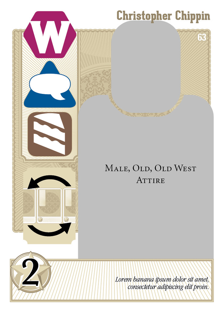
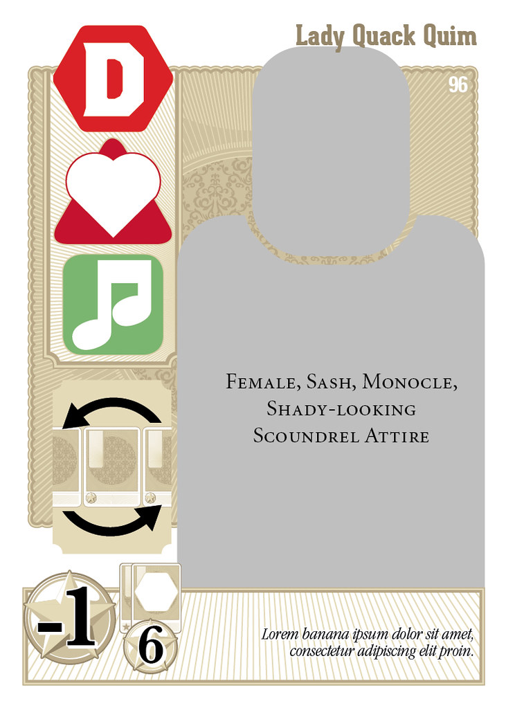
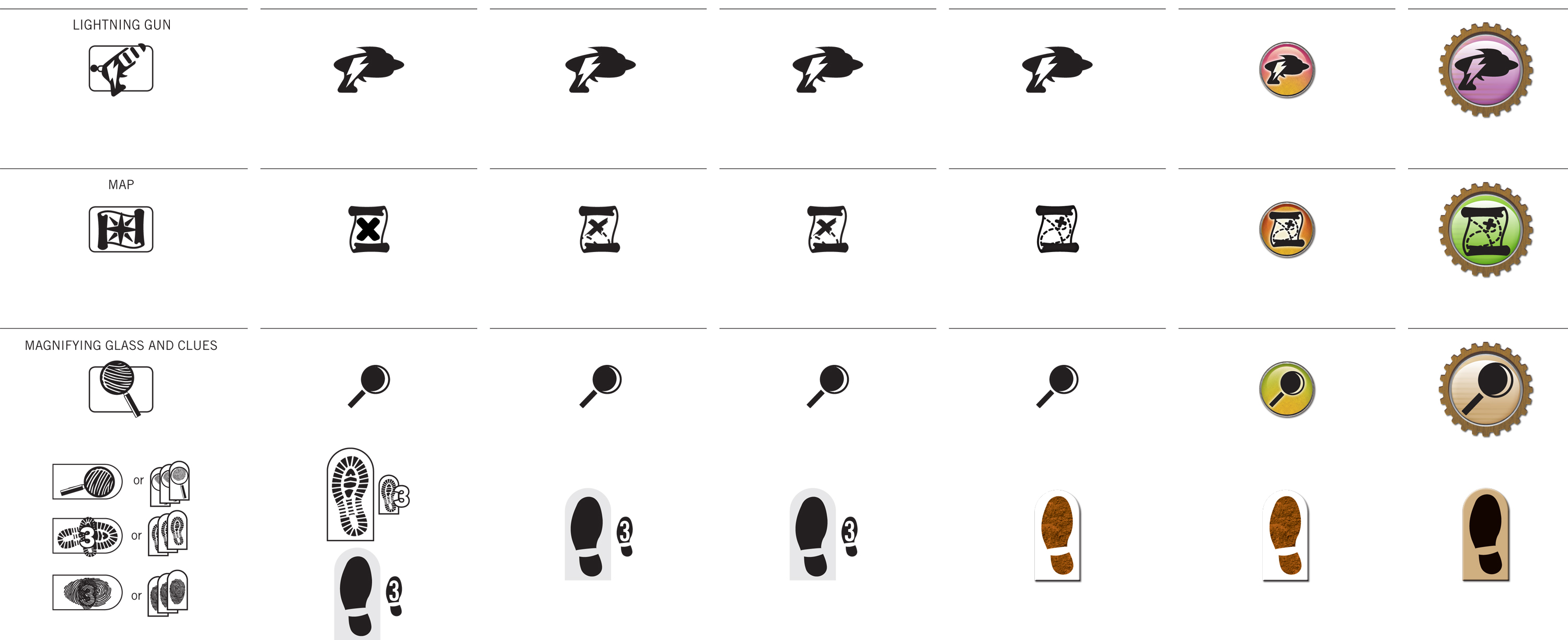
2: If it's said repeatedly, say it in symbols.
Depending on the kind of game you're making, you'll probably have certain phrases that come up frequently. Instead of repeating yourself and wasting valuable text real estate, just make a symbol that stands in for that piece of text.
"Deal two damage to any monster. Deal an extra damage to any Fire-based monsters." can be replaced with [SWORD] [SWORD] (+[SWORD] vs. [FIRE]).
"Draw two cards. Keep one and discard the other." can be replaced with [CARD with an X] [CARD with a CHECKMARK]. There is always a danger in overcoding your visual language, but if executed well, it'll make your game more accessible and playable.
3: Set the right style for the context.
The first thing young designers learn is that 12pt Times New Roman is the Devil. Young designers then overcompensate for years, insisting on 8pt regardless of context. We all have to get over that eventually and learn that there is no one golden rule that fits all contexts. A little card is different from a game board is different from a rulebook.
Here's a simple rule of thumb, though. Up close, set your body text at 10-12pt. Arm's length, 12-16pt. Across the table, 24pt. Always make your leading at least 1.5x the text size. And always, always choose a classic, legible font without any flourishes. I personally recommend Trade Gothic or Frutiger, but both have a distinctly modern feel that might not jive with your game's theme. You might be happier with Garamond or Caslon.
And lastly, if you simply must have flavor text, it's okay for that to be 8pt. It's an easter egg, not critical to actual gameplay.
4: Choose the right background.
Most card games have consistent block backgrounds in which you'll find the rules text, flavor text and any other important words. For the sake of efficient production, that background block is kept to the same size, regardless of its contents. That means cards with little text may have lots of unused space, as Chris notes in his critique.
That being the case, I highly recommend first taking steps 1 and 2 to make sure you're using text as efficiently as possible. With that base established, set your background block to fit your text. You can do this manually card-by-card, but that's a bit of a pain. Try setting a thick stroke around your body text style so your text effectively creates its own background.
Alternately, you can use a 0-distance, high-spread drop shadow. Either way, the background should be high contrast with very little texture or pattern that would interfere with the text.
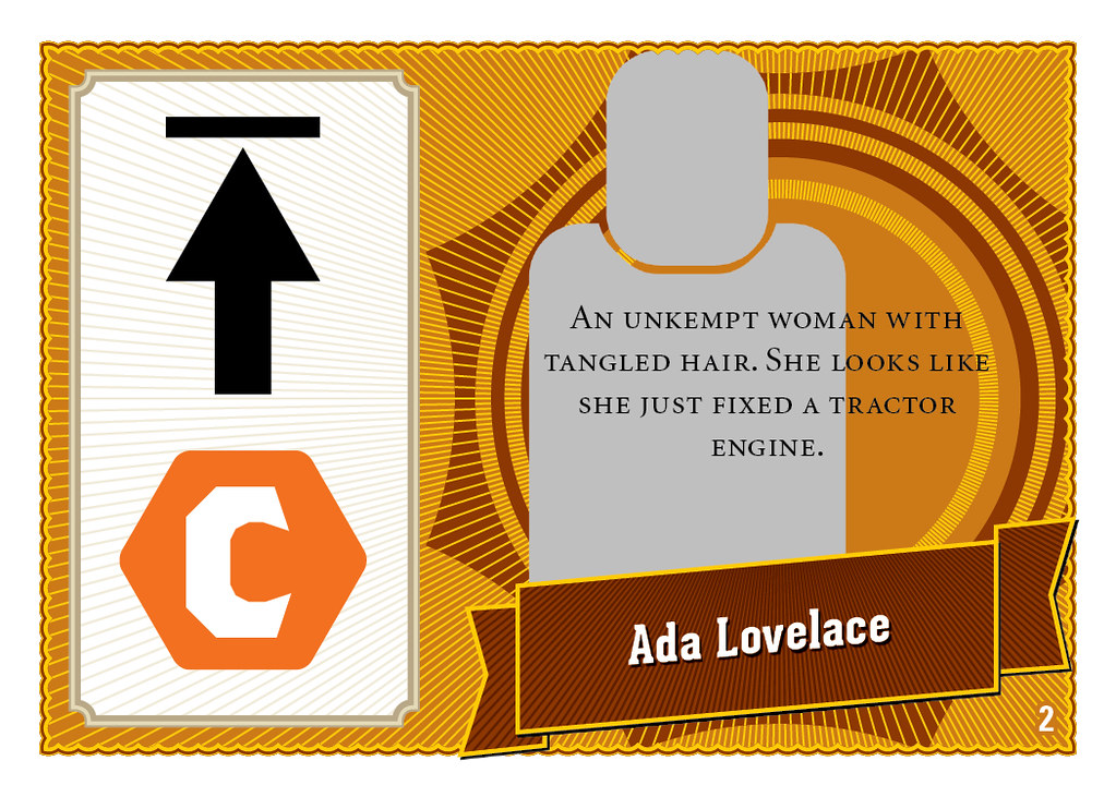
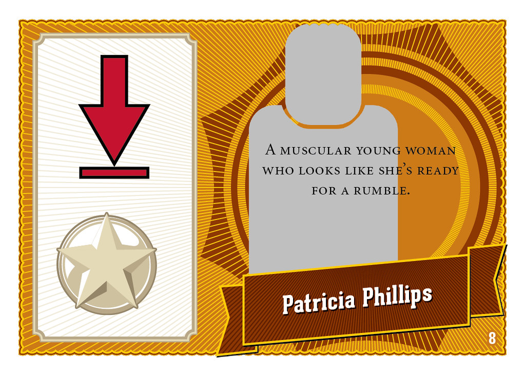
5: Choose the right art.
And last but not least, the remaining 80% of card real estate is probably taken up with some gorgeous art, right? Just make sure the art actually communicates what is said in the text. In the chaos of the gaming table, the text "Firehose: Deal 7 damage to fire-based monsters" might get covered up by some other cards or a nacho or something. But if your art actually shows a bunch of fire elementals getting fizzled out by a firehouse, the message is still effectively communicated.
And that's that! Some simple steps you can take to keep Chris from complaining about *your* card game. Personally, I like the design of the cards in King of Tokyo. The titles are all custom designed and there's plenty of room for the awesome, illustrative art. The actual body copy is still a wordy on some cards and could afford to be larger, but for the most part KoT gets card design right.
Thursday, June 16, 2011
Cover Design for J.R. Blackwell's "Shelter In Place"
J.R. Blackwell asked me to lay out her zombie LARP Shelter In Place. For now, here's the first draft of the cover. and the rationale I sent along with it:
"I decided to use real photos to make it clear that this isn't a tabletop RPG, which would normally use illustrations or computer-generated art on the cover. The first thing you see is a pair of eyes staring right back at you. I imagine these eyes would pop even if the book is on the back rack in the indie RPG shelves. All photos are sourced from CC-licensed Flickr photos or stock imagery.
"I'm continuing the severe diagonal motif from the inside pages as a structure for the rest of the cover elements. To contrast the cold teal of the top half, the rest of the cover is an intense hazardous orange, like traffic cones or hunting jackets.
"I hope you don't mind that I added "live" to the tagline. Purely from a marketing perspective, I thought the parallel between "live" and "zombie" was striking. If I were to go further, I'd probably phrase it as The Live Action Game of Undead Horror, to more directly contrast "live" and "dead." "Live Action" calls out to the LARP gamer, without alienating a potential buyer by using that acronym. Also "The" positions the game more confidently as the definitive zombie LARP game on the market. Anyhoo, that's just my two marketing cents. I'm happy to replace the tagline with A Game of Zombie Horror."
This isn't the first time I have slightly augmented a creator's tagline during the cover design process. When I designed the cover for John Wick's Wilderness of Mirrors, I changed its tagline from "A Spy-Playing Game" to "A Better Spy-Playing Game" since so much of John's personality expressed confidence and certainty about his game's virtues.
On top of that risky move, I used photos on the cover. Now, J.R. is an accomplished photographer in her own right and I was a little worried about using someone else's photos in her book. Want to know if she liked it? See for yourself:
"These are colors I never would have chosen, fonts I didn’t know about and a layout that I couldn’t have asked for. And I love them. I love this cover so much that last night I carried it around with me at a party to show to the other guests 'Look at this,' I said, like a proud mama with a baby 'Just look at how wonderful it is!'"
Monday, May 30, 2011
Page Samples from Do: Pilgrims of the Flying Temple
The cover's done, the inside layout is done, and over one hundred proof readers have scoured the text for typos and errors. Above, you can see some page samples from the book. The team is giving the print files one last pass before we go to press tomorrow morning!
Tuesday, April 26, 2011
Back Cover Progress
It's been a very travel-ful couple of weeks for the day job, so I haven't had a chance to get much done on the back cover yet. I'm still futzing with overall color palettes and getting the basic composition done.
I'm looking at Fire Nation and Air Nomad outfits for the pilgrims, but the bird is still problematic. It's very far away, so I don't want to get too detailed. But I don't want it to seem flat, either. Hmm...
Anyhoo, pushing onward!
Subscribe to:
Comments (Atom)


