Showing posts with label tips. Show all posts

Monday, May 6, 2013

The Sorting Hat Effect: Avoiding the Hazards of Endgame Scoring

Quest_Fantasy_Exhibit_Opening-3952

I've been playing Ascension on iOS for a few months and in that time I've had a lot of fun... Until the endgame, wherein I discover all my efforts have been in vain as my opponent has doubled or tripled my score. I can deal with consistent loss in a game, but consistently losing when I think I will win is frustrating.

This speaks to the value and purpose of endgame scoring in general, I think. As all modern gamers would recognize, hidden endgame scoring keeps all players engaged until the very end. There's always this chance that you'll beat the odds, because you've had a clever engine building for the whole game. There is a lot of dramatic fun in pulling back the curtain to reveal your grand idea, even if another player ends up beating your score.

When designed well, these endgame mechanics can be learning experiences for players to try again with a slight adjustment to their strategy. However, they can also appear to be black boxes, capriciously deciding a victor after the fact.

I call this the Sorting Hat effect, after the hat who decides the dormitory for each student at Hogwart's regardless of their input. Richard Garfield uses "Randochess" as an example of this phenomenon. In Randochess, players play a full game of Chess, then roll a die. If it results in a 6, the loser of the chess match actually wins the whole game. Why does this suck? The winner of Randochess doesn't feel like they earned it and the loser feels like they were cheated.

Here are some other examples of endgame scoring:

  • A lot of people dislike Carcassonne because the farm scoring is so opaque that they get blind-sided when a more experienced player wins the game thanks to some well-placed farmers. But at least in that case, the information is public, and, more importantly, can be manipulated mid-game.
  • In the case of Lords of Waterdeep, each player gets an endgame bonus for having accomplished tasks in certain categories. That can have very drastic swings in endgame, but they very rarely comprise more than a third of a player's final score, so it still feels like you have control over your fate to some extent.
  • In the case of Seasons, I also lose pretty handily every time, and the endgame score can be almost half of a player's final score. However, there is a lot of fun happening mid-game by building engines, timing actions, and interfering with opponent's engines.

So, this indicates a rule of thumb for myself when I design an endgame scoring mechanic.


  • Visible: The endgame state should be visible to all players, even if it is a little complicated for a newcomer to decipher.
  • Adjustable: The endgame state should be adjustable mid-game, so clear leaders can be recognized and targeted accordingly.
  • Small: The endgame state should comprise about a third of a player's final score. More than that makes the game too swingy, less makes it feel like an afterthought.

I can deal with an endgame score that follows at least two of those three rules of thumb. (ex: If it's too big, I can deal with that because I saw it coming and could have adjusted for it.) Those are my takeaways anyhow. What are yours?

Friday, June 1, 2012

Three Best Practices of RISK: Legacy-Style Game Design

RISK Legacy:  The Russians and Germans are in a heated struggle - Looks like my RISK: Legacy post got some traction on Google Plus and BGG. What's funny is that the key attributes of Legacy mechanics are something that most traditional RPGs take for granted. In-game choices having persistent effects in future sessions? Pretty standard stuff in the RPG realm. 

Granted, that process usually doesn't involve destroying the actual object.

I think "destruction" is a misnomer in this case. Yes, you do change the game, but whether you consider that "destruction" is a matter of perspective. When I design a new game, I prune off many paths in the process. What Rob Daviau has done in RISK: Legacy is stop juuuust shy of that point in the process.

For example, in the very first game, you have a choice of two faction power stickers to put on your faction card. The one you don't choose is torn up and thrown away. Is that sticker destroyed? Yes. Is the game destroyed? No. The players are simply making the last decisions about how to arrange point values, terrain effects, and faction powers. They join Rob in the game design process. When faced with a choice like the one above, I really feel like I'm creating the game, not destroying it.

So, here are some best practices for making a Legacy-style game as far as I can tell.

1 | Creation
When you can name or label something, that act is satisfying in its own right, even without any mechanical effect. It can be a simple channel for vanity ("Georgetown") or something that reflects actual events in the game ("Dead Man's Valley"). There is great power in naming the unnamed. Don't feel compelled to tack on mechanical effects. Sometimes the warm feeling of seeing a continent named after your child is all you need. Speaking of which, this principle a great way to get kids involved. Kids love naming stuff.

2 | Persistence
Make some choices have repercussions in all future games. The key to making this work is recording that data. This is where computers have an advantage on humans. Still, a good sharpie and some clear terms can help a lot. Who won the game? Make that mean something. Who hasn't won yet? Make that mean something. Are there features on the board to claim? How often is that done? Make that mean something. Are there unlockable components? How often do they get opened? The trick is pacing those changes. Know your game's probabilities and pin your game's dynamism to that curve.

3 | Stasis

There is an endpoint where no further changes can be made to the game. This could be an organic endpoint, like stickers running out or spaces being filled in. It might also be a relatively arbitrary endpoint, like a certain number of sessions. Whatever your terms, this is the point where the players are done designing the game. Make sure the game is playable after this point, just not changeable. You'll still get those voices from the balcony grumbling about wasting money on a game that can't be played after a certain point. Just ignore 'em. ;)


So, am I right? Totally off base? Sound off in the comments!

Tuesday, May 22, 2012

Email Your Ducks: 5 Kickstarter Freelance Hiring Tips

Ducklings
You may recall my last post on the freelance market around Kickstarter. There I mentioned Lyndsay Peters of Dragon Chow Dice Bags. She works with a lot of Kickstarter projects these days. So many that she now has a reputation as a go-to source for high-value pledge tier rewards.

The problem is that sometimes, Lyndsay finds out she's hired for a project after the Kickstarter launches. For one reason or another, the project creators assumed she was available without further confirmation, with no further details on estimates, quantities, or timelines.

So far it's been fine, but eventually Lyndsay will get roped into a project she doesn't want to do or she won't have time to do. How embarrassing will it be for the creator to have to say "Sorry, we actually can't offer these super-awesome dicebags after all."

This little anecdote shows how fraught the burgeoning semi-pro economy can be for a freelancer. I worry about inexperienced project creators getting disappointed when they thought they had lined up a freelancer, but in fact had not. "Hey, you said you could do this!" the disappointed creator might say. Through no fault of her own, now that freelancer got a smudge on her otherwise professional record.

I understand that as a project creator, you don't want to commit to hiring anyone until after the Kickstarter succeeds. After all, that's the whole idea of Kickstarter. Just follow these simple best practices for hiring a freelancer to work on your Kickstarter project:

1. Email the Freelancer
It seems like common sense, but hey... Start a discussion on the record with your potential freelancer. Explain up front what your Kickstarter is going to fund, how much work there would be for the freelancer, and your timeline.

2. Get an Estimate
After getting all the details, your potential freelancer can give you a rough estimate of what she can deliver given your specs. You should have a firm grip on the scope of work before this point. If the scope changes, alert your freelancer and get a revised estimate. Scope changes can include changes in quantity, dimensions, deadlines, and new constraints. Knowing deadlines is particularly helpful since it affects your estimated time of delivery.

3. Get a Handshake (or sign a letter of agreement)
Now that you have an estimate from your freelancer (and any other vendors you'll need), you can let them know when your Kickstarter is launching, when it will be complete and when they can expect to hear from you. Your freelancer agrees to keep some space open in her schedule and to let you use promises of her product as a part of promotion. Otherwise, there is no formal commitment in place and the freelancer will not do a bit of work until the Kickstarter succeeds and gets paid.

4. Sign a Contract and Fill out Paperwork
After your Kickstarter succeeds, you're ready to hire! (This is where you might want some legal help, I am not a lawyer, so take any advice here with a grain of salt.) Refer to the previously agreed-upon terms to write a more formal contract. I usually offer half of the payment upon signing and the second half at the completion of work. Also, fill out any tax paperwork necessary for your area. (Did I mention I'm not a lawyer? Really, get some professional guidance here.)

5. Update your Backers
One of the nice things about a Kickstarter campaign is that you have a ready, listening audience who loves to see new images of the product in progress. Share samples, sneak peeks, desktop wallpapers, etc. The backers will love it and it's a nice audience for your freelancer. When the freelancer's work is complete, pay any remaining fee and move ahead to any final production.

Following these simple best practices gets all your ducks in a row and makes sure your ducks know they're in a row.

Friday, May 18, 2012

Belle of the Ball Prototype Cards from SuperiorPOD

New Belle of the Ball prototype cards from SuperiorPOD
For independent or DIY game designers, there haven't been many affordable options for printing card games until recently. I decided to try out SuperiorPOD mainly because their pricing structure was clear, their interface was easy to use and their templates were super-helpful. Here are the results of two separate card orders.

These cards are pretty thick and sturdy. They're not matte or linen, which would normally be ideal for game cards, but they still shuffle extremely well. Above, you see the thickness of a full 108-card deck, which is the largest deck SuperiorPOD offers on their website.

The first order printed much brighter and yellower than I intended. That order was printed from a print-ready PDF (PDF-X 2008 Protocol). I suspect some of those vector elements just rendered unexpectedly. In the second order, the files were simple flattened TIFFs. Larger file size, but also simpler to render.

As you can see, the reds, grays and oranges are mostly the same in both printings. However, the second printing more accurately picked up the subtle beige background patterns as intended.

The blues, teals and greens were the biggest problem areas in the first printing. They printed much yellower, which turned a teal into an aqua. The second printing still had a touch too much yellow in the skin tone, but otherwise was much improved.


And take a look at how thick they print black ink. You can really see it raised off the surface of the cardstock. This might be what makes the cards easier to shuffle. The irregularly raised black ink may create just enough void between the cards to let them sift easily between each other. In the aggregate, this may also make the deck bigger than you expect, so make sure your box isn't too small.

Timelines
First Order
Files Sent to SuperiorPOD: April 8
Shipment Sent by SuperiorPOD: April 24
Package Arrived: April 27

Second Order
Files Sent to SuperiorPOD: May 2
Shipment Sent by SuperiorPOD: May 14
Package Arrived: May 17

Overall, I'm satisfied with the results! It takes some very conscious tweaking of your files to get the best output, but if you're looking for an affordable POD printer for your card games, give SuperiorPOD a shot. Soon, I'll print some cards with The Game Crafter and report the results.

Thursday, May 17, 2012

Feedback Loops in Game Design [Infographic]

Feedback Loops in Game Design

FULL TEXT:

FEEDBACK LOOPS IN GAME DESIGN
as observed by Jesse Catron, Jay Barnson, Kyoryu

Design: Daniel Solis (danielsolis.com)

In a feedback loop, the output affects the input.

POSITIVE FEEDBACK AMPLIFIES the output and tends to destabilize the system. For example, the runaway leader. One player takes an early insurmountable lead.

In Settlers of Catan, the player with the most productive settlements will generate the most resources, which enables him to build more settlements and gain even more resources.

NEGATIVE FEEDBACK DIMINISHES the output and tends to stabilize the system. For example, a “take-that” mechanic that gives trailing player’s more opportunities to constrain the leading player’s efforts.

In Settlers of Catan, players are less likely to accept trades with the leading player. The leading player is more likely to be targeted by the Robber.

Balancing feedback loops is an important skill for all game designers.

DECK BUILDING

[ + ] You can use low value “copper” cards to buy higher value “silver” and “gold” cards, thus leading to greater and greater amounts of buying power later in the game.

[ - ] Victory is determined by collecting Victory Point cards, which have no short-term tactical value and simply take up space in your deck.

RACING / KING OF THE HILL

[ + ] Once a driver takes an early lead, they can shift to high gear to increase speed. While the trailing drivers jockey for more optimal position, the leader has few obstacles.

[ - ] Curves and hazards can make speeding dangerous, allowing trailing drivers to catch up. If cars have weapons, this makes the leader a likely target.

KNIZIA SET

[ + ] Players collect several different types of resources. Each resource has unique properties. Some of which may buy upgrades that make acquiring resources easier.

[ - ] Victory is determined by collecting the most full sets of all resources. Focus is spread across a broad spectrum of tactical decisions.

SOURCES
hyperbolegames.com/2012/05/11/game-design-gone-loopy/
rampantgames.com/blog/2009/08/game-design-positive-and-ne...
www.design.wrong.net/?p=14

“Refresh” symbol by Joris Hoogendoorn, from The Noun Project
“Flag” symbol by Brad Hollander, from The Noun Project

Released under a Creative Commons - Attribution license

Sunday, May 6, 2012

Variable Data in Card Game Design


I've certainly had an educational weekend. Right now I'm laying out three card games: Zeppelin Armada, Velociraptor! Cannibalism!, and Belle of the Ball. I'm kind of using Belle as a training ground to become a more efficient card game layout-er, 'cause damn that's actually a really a fun job.

What wasn't so fun was manually inserting every digit and icon directly into the layout. It was prone to typos, misalignments and subtle printing inconsistencies. I knew the big guys at WotC couldn't be setting up their Magic cards this way. Perhaps there's a way to automate this process?

I have some experience working with print houses who do what they call "variable data." It goes by several names, kind of like the Devil. Indeed, the central feature of variable data turns out to be spreadsheets. Not quite Lucifer, but close.

I followed Adobe's datamerge tutorial. I managed to figure it out thanks to several video tutorials that you can see at the top of this post. Each tutorial lacks in some areas, but others compensate. When you've watched them all, you get a real sense of how this can be used in card games.

For an example, check out this spreadsheet for Belle of the Ball. Some of the columns list plain text, others list .eps images that I call where necessary. These images are card icons generally, though the "PORTRAIT" column is where I'll call the portrait art. Now, I can set up one card template and be sure that all the icons, text, and art are in exactly the same positions.

Very powerful kung fu here, folks. Imagine you're making a card game like Magic: The Gathering. Your suits will have different backgrounds, each card has unique art, several cards have recurring icons in different amounts, and all have varying blocks of text. Using layers in InDesign, you can set aside spaces for all these elements without fear of them overlapping each other in unpredictable ways.

Set your background image block in a BACKGROUND layer in InDesign. Do the same for ART, ICONS, and TEXT in ascending order. Then you lay out your image and text frames as per the tutorials above. There you go, no fuss card game layout.

P.S. If you are making a game like Magic, and you'd rather show quantities as a row of individual icons instead of a single digit (like mana cost), there are two things you might do:

One, you can set aside several columns representing each potential space for mana cost icon. Then, insert the appropriate .eps as necessary. This may be tedious, but it's relatively straightforward.

Two, you can create a special font for ALL your game icons. Then, you don't have to call any special .eps files at all. You can just insert normal text into your spreadsheet, set the InDesign text styles to your special font, then voila! You have yourself a card game.

Thursday, April 26, 2012

Hierarchy of Interface for Tabletop Games – The Stavro Principle

Hierarchy of Interface for Tabletop Games as observed by John Stavropoulos (Source)


TOOLS
The actual components of play, like character sheets, cheat sheets, boards and bits.

TEXT
The actual documented rules and how they are presented, including exact wording, procedures and game terms.

RULES
The parameters of play as best recalled by the players. Less formal than text, but more formal than the basic design intent.

INTENT
The assumptions of how a game would be played, often expressed directly by the designer with minimal formal documentation.

“Dice,” “Pencil” symbol from The Noun Project collection.
“Paper” symbol by Tom Schott, from The Noun Project collection.
“Quote” symbol by Henry Ryder, from The Noun Project collection.
“Note” symbol by Brendan Lynch, from the Noune Project collection.
“Pawn” symbol by Kenneth Von Alt, from The Noun Project collection.
“Dialog” symbol by Dima Yagnyuk, from The Noun Project collection.


This graphic is released under a Creative Commons Attribution license.

So, a little background: John made some observations about RPG rules presentation on a Google Plus thread. Luke Crane suggested this could be modeled as a hierarchy by some designerly folks. I took the case and made slight slight tweaks broaden the scope to board games, too. Feel free to use this in your discussions. I'm not really interested in getting into game theory debates though. :)

Thursday, April 5, 2012

Crystal Mandalas in Card Game Design


After describing the organic "wabi-sabi" style of card game design I used in Belle of the Ball, I got some comments on boardgamegeek expressing a preference for more symmetrical deck design.

Mark McEvoy : "I'm of the camp that prefers the symmetrical systematic approach because then you can be certain that specific combinations exist / are unique / are not disproportionately plentiful in your deck."

David Boeren : "If there is ever a time where the different elements interact with each other then I do not want them randomly assigned. That makes it harder to balance and it makes it hard on the players who now have to remember a lot more about the deck to avoid bad play decisions."

Sure, I see the appeal. But speaking as a designer, it's way too easy to get sucked into a death-spiral of perfectly symmetrical mandalas. These precious crystal structures are such fastidious distractions for OCD perfectionists like me.

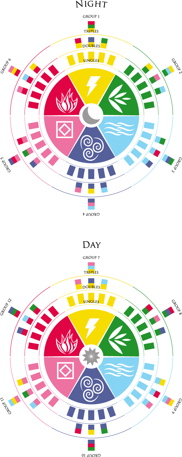
The example above is one way to divide up a 180-card deck. There are two halves (36 cards each; day, night), six elements (28 cards each; fire, electricity, plant, water, air, earth), and twelve individual groups (9 cards each; Group 1 – Group 12). Sixty cards have a combination of one half, one group and one element. Sixty cards have a combination of one half, one group and one element. Thirty-six cards have a combination of one half, one group and two elements. Twelve cards have a combination of one half, one group and three elements.

Oh, but wait! What about cards with four elements? Five elements? Could some cards straddle two or more groups? Is there a ranking system for the single-element cards? But crap, that would make more than 108 cards. Whatever shall we do? omg!

Yeah... See what I mean? This kind of meticulous deck composition is waaay too fussy. More time is spent organizing these compositions than actually designing a game. Sure is pretty to look at, though.

Wednesday, February 15, 2012

Affordable Success: Why I'm Postponing the Kickstarter for Utara Dice Game

Utara Dice 2
I've decided to postpone plans for kickstarting my dice game Utara. Here's why.

Utara's biggest problem is that it calls for so many custom dice. I thought I could manage it as a small outfit thanks to new tools like Kickstarter. That opened up opportunities for high engagement and distributed costs. Those would compensate for high up-front production expenses of custom dice. That expense was just from the relatively affordable option of laser-engraved dice. Each of those would cost $1.10 to make at a quantity of 2,000.

Pricey, but at least it followed the model of similar novelty products like Mathematician's Dice and Writer's Dice. We figured a goal of ~$4,000 would get us where we needed to be. The trick would be focusing on the novelty and flexibility of individual dice, rather than the game Utara. We'd need to develop more properties using one, two or three Utara dice, but at least it could be done.

As I sought feedback on the tier rewards, it became clear that if I was to focus solely on the dice, most people wanted something a little more refined. The ideal would be ivory dice with black inlay engravings, like old piratey artifacts. Unfortunately, the cost for that spec would be $2.50 per die for 2,000 dice. The rule of thumb for retail is mark up about 3x-to-5x your production costs. That means a single die would be a little under ten bucks! Even with bulk consumer deals, like a set of ten for $30, the price point would be much higher than a similar product from a larger company. (Martian Dice comes with more dice for a fraction of the retail cost, for example.)

So, the next viable alternative is to actually go for an injection molded run of dice, custom made just for Utara. There are international options for just this purpose, as I learned from Fred Hicks. Turns out those prices per die were something like pennies per die, but required much higher quantities in a single production run. The ballpark guesstimate was something like 30,000 dice for around $7,000. However, those would take months to produce, go through customs, and travel by freight ship across the ocean. Then I'd need to hire a warehouse to store, sort and fulfill individual orders (unless I wanted a mountain of dice sitting in my living room.)

Even then, assuming a single retail unit contained 30 dice, for all that trouble I'd only get 1,000 units to sell. To be truly feasible, I'd need to order far more than 30,000 dice. 50,000? 100,000? I had enough trouble carrying a box of 2,000 from my car to my doorstep. I shudder to think about how much more of a hassle a larger quantity would be.

It's clear that I'm in this transitional period between boutique designer and middle-sized producer. What I kickstart next has a strong chance of succeeding, based on whatever social capital I've accrued over the past three years. That being the case, I really need to keep affordable success in mind.

That means if the Kickstarter succeeds and I can't fulfill on what I promise, or if I have to compromise on quality, that social capital will be squandered. So, I can't pursue a Utara Kickstarter right now. Even if I set a Kickstarter sky-high and it succeeds, I just don't have the time or infrastructure necessary to make it a product without compromise. It'll just have to wait for a partner with deeper resources somewhere down the line.

Thanks for following the ups and downs of Utara. It'll come some day, just not right now. For now I'm going to pursue formats that are much more feasible for a small guy like me. Card and party games with minimal components that can be domestically manufactured and distributed in small runs. I have plenty of options in that space.

Superhero Audition, Belle of the Ball, Dead Weight, Dung & Dragons, Stupor Market, What's Your Excuse?!, and For The Fleet are all worthy candidates. Which interest you?

Tuesday, February 7, 2012

5 Tips for Crowdsourcing Content as a Kickstarter Reward

crowd surfer

Folks asked if I could share some best practices on crowdsourcing content as a part of a Kickstarter campaign. Ooh boy, yeah. Crowdsourcing is a very fun way to engage your backers in the project. It's like a giant mad libs. I've incorporated crowdsourced content into Do: Pilgrims of the Flying Temple (letters, characters), Happy Birthday, Robot! (examples of play), and soon Utara (island names). There are a few basic tips I've learned.

1: Survey your real estate.
"We're releasing a role-playing game with a random citizen generator. Want to be listed as a resident of our world? Pledge now and join up!"

What are you offering and how much of it can you offer? If you can, offer examples of the context in which your offering will appear. For example, if you wanted to include a d100 random citizen generator in your game, you could offer space in that list for high-level backers. Limiting the availability increases the value of that space. As the spaces get sold out, that also gives you stuff to post updates about throughout the Kickstarter campaign, ie screenshots of the page with the generator.

2: Keep submission guidelines clear and constrained.
"[Tier Description] Backers at this level will be listed in the book as a citizen of the worlds. See the description details. [Then in the body description...] Each listing can be up to 100 characters. Please submit by January 1st. All submissions subject to editorial approval, so keep the language clean, folks. For example: Jenn Wong raises striped unicorns for their magical feathers."

Make the submissions as easy to create as possible, with clear guidelines. Short text is usually a good standby, as you can see from any rapidly trending Twitter hashtag. If their submission doesn't fit, gently offer alternatives and explain why their submission doesn't fit your guidelines. These are paying customers, but they also respect your vision.

3: Declare your default format.
"If you prefer, or if the deadline has passed, we'll make up a submission for you based on your name."

People are busy, so be prepared to come up with this content yourself. Write these up ahead of time with your team and leave open blanks for backers' names. Twitter can be very helpful in this process, but also call for ideas from all channels: blog, google+, facebook, etc.

4: Take requests.
"If you'd like your entry to be named in honor of someone else, let's talk!"

We got lots of backers in Do who wanted their children, friends or family to be named instead of themselves. That, or we got requests to incorporate their interests or occupations. We tried to accommodate those requests whenever possible. As soon as you get a request, make special note in the Kickstarter backer report for that person.

5: Use custom survey questions and the Backer Report functionality.
"Congratulations! You're a citizen of the worlds. Tell us in under 100 characters, what's your name and what do you do?"

When you ask folks for their shipping information, you can append custom questions to the survey to get their content all at the same time. I can't overstate how useful the backer report is for keeping all this information in one place. Export the CSV, load it onto Google Docs and share it with your team so you can all collaborate at the same time.

Any more tips you'd share for crowdsourcing content?

Saturday, January 28, 2012

Follow-up on the Costs of the Writer's Dice Kickstarter Campaign

In the spirit of transparency, I wanted to share a basic overview of costs for the Writer's Dice kickstarter campaign. Many thanks to my wife Megan who's been keeping track of this info. Our costs consider the following:

• Kickstarter's cut
• Amazon Payments' cut
• Final product dice
• Prototype dice
• Baggies
• Address labels
• Padded envelopes
• Mailbox rental
• Shipping

A total cost of $4375.

That's rounded up slightly to consider the stragglers we still need to ship out. The amount does not consider things like any returned packages (extra postage), printer ink, mileage, and our time/labor. We haven't found out the costs of North Carolina sales tax just yet, which Kickstarter doesn't have a way of calculating. Also, the amount of postage for parcels went up a bit before we were able to send everything out, which raised the overall cost of shipping somewhat higher than we expected.

We probably could have saved a tiny bit of money by not renting a mailbox or buying address labels, but the first three items on the list were by far the most expensive costs incurred. The one way I might be able to reduce costs is going to an overseas manufacturer, but I like keeping business in the USA and I have a good rapport with GameStation.

Fred Hicks has mentioned that if we were to go to traditional retail, we'd want all our costs so far to be about 20% of the gross. Direct sales, which is actually what we're doing, can be feasible with a cost 50% of gross. The costs of the campaign alone put us at just over 50%... but that's only part of the story.

We still have about ~390 dice left to sell through an online store. If we price those dice with a more accurate shipping cost (especially for international orders) we can cut those costs back down under 50%. The remainder of profits could be enough to fund a new production run of another product, like Utara. That will take some time, though.

It's also worth noting that my initial fundraising goal of $1,000 was probably waaaaay too low. Even with the smaller production run, the costs of shipping and the cuts from Amazon and Kickstarter would've put me well in the red. Now I know what a basic goal should be for a similar project.

So, bottom line: Next time I run a Kickstarter for a single custom die (qty: 2000), I'll need to raise a minimum of $4,000 to cover basic expenses.

Saturday, December 3, 2011

Tips for Customizing Hand-Drawn Fonts in a Logo, Title or Masthead


I wanted to use a nice cartoony font for the masthead of Pop and Locke's Last Heist. Blambot is always a great source for very well-done fonts in a variety of comic book styles. Nate Piekos has been in the business a long time and it's hard to beat the price for his fonts.

I used 12 Ton Goldfish. It looks great, but there is a common problem with hand-drawn fonts. When you have repeating letters, like the Ps and Os, you can tell they're identical to each other. It's an immediate tip-off that you just used a font without any additional revising to make it work for your purposes.

So, I customized the font in a few ways and I thought I'd share these tips. Follow these in order as you customize a font for your logo, title or masthead. But first, before you even try doing any of this I have one tip. Write the letters yourself! Grab a marker, try a few different tips, write them big, small, on paper, cardboard, etc. See if you can't draw the letters and get them just as you want before downloading a font. If you don't want to go through the trouble, then let's get to the fonts.

You're voiding the warranty.
Before you go tweaking any fonts on your own, a note of caution about the classics – Your Helveticas, Garamonds, and so on. Those are more than just fonts, they're freaking typefaces, drawn to exacting specifications for very particular purposes by master typographers. Adjust those at your own risk. You're better off adjusting fonts that are already hand-drawn. Their organic personalities will much better tolerate your tweaks.

Move the letters around.
Before you try editing the actual letterforms, try moving each one independently of the others. Move them closer or farther from each other. Move them up and down. Change the rhythm and beat and flow of the letterforms to your taste. In my case, I straightened out the letters in my masthead a bit so they followed the same baseline.

Adjust the thicks and thins.
Look at the vertical strokes of each letterform and try widening them or narrowing them. When you do so, make sure the strokes still maintain a relatively consistent width from end-to-end. If the width does change, make sure it does so gradually, without the harsh perfect angles indicative of a computer font. In my case, I made the vertical strokes of the Ps wider than the rest of the letterform. I also moved the counterspace of the Os a little to the top-right so the lower-left stroke is a little thicker.

Rotate, resize, but keep proportions in mind.
If you still want to to customize the font, try rotating an individual letter a few degrees clockwise or counterclockwise. I definitely recommend this for repeating letters in hand-drawn fonts where slight deviations make the whole graphic feel much more authentic. In my case, I rotated the Os and Ps. I also resized the "AND" so it wouldn't be as prominent as the two names. I made "AND" shorter, but kept the horizontal strokes didn't get thinner in the process.

Finally, change the actual shapes.
Once you've done all these edits, you may still want to make some edits to get things juuuuust right. In my case, I noticed these really sharp angles in the A and N in "AND" that just did not fit the flat terminals in the rest of the letterforms. So I cut off those angles to make them flat.

And that's it! In the image at the top of this post, you can see how the original plain font looks compared to the customized version. Doing these little tweaks helps make your logos and titles stand apart from the pack. Just remember, these are tweaks. If you go around stretching fonts willy-nilly, don't tell anyone you were following my advice. ;)

Tuesday, November 29, 2011

5 Graphic Design and Typography Tips for your Card Game


Chris Farrell of Illuminating Games just wrote a thorough critique of card games setting their body text to be so small that they cannot be read at arm's length, let alone across the table. Here's an excerpt, but the whole thing is worth a read for any would-be card game designers out there. (Myself included.)

Break out your copy of the base set of Dominion, and look at the Chapel. This has a text box roughly 3.5cm by 4.5cm. It's got a single line of text. That line of text is 1 (one) millimeter high. 1mm! For me, it's only clearly readable at half an arm's length even in the bright light of day. (...) Compare this to a more sane game like Glory to Rome, where the font size is 2-3 times as large (text is 2mm high, keywords 3mm and usually highlighted). I can generally read Glory to Rome cards across the table, and can certainly see the important keywords. To heap insult upon injury, not only does Glory to Rome have far more legible text than Dominion it also has larger art. San Juan also thankfully starts at 2mm, although it could still easily be larger with no loss of aesthetics.

Here are some tips for designers who want to stay on Chris' good side.

1: If it can be said in fewer words, say it in fewer words.
Alright, before we get into any matters of layout, the first thing you have to do is look at how well you're using your text. Survey all the cards in your game and set a benchmark for the amount of text acceptable on any card. I recommend no more than two or three lines. Whenever I come across a card with more text than that, I tend to just ignore it. There are probably other, easier-to-understand cards available elsewhere and I'd rather get to play than puzzle over a miniature wikipedia article.

2: If it's said repeatedly, say it in symbols.
Depending on the kind of game you're making, you'll probably have certain phrases that come up frequently. Instead of repeating yourself and wasting valuable text real estate, just make a symbol that stands in for that piece of text.

"Deal two damage to any monster. Deal an extra damage to any Fire-based monsters." can be replaced with [SWORD] [SWORD] (+[SWORD] vs. [FIRE]).

"Draw two cards. Keep one and discard the other." can be replaced with [CARD with an X] [CARD with a CHECKMARK]. There is always a danger in overcoding your visual language, but if executed well, it'll make your game more accessible and playable.

3: Set the right style for the context.
The first thing young designers learn is that 12pt Times New Roman is the Devil. Young designers then overcompensate for years, insisting on 8pt regardless of context. We all have to get over that eventually and learn that there is no one golden rule that fits all contexts. A little card is different from a game board is different from a rulebook.

Here's a simple rule of thumb, though. Up close, set your body text at 10-12pt. Arm's length, 12-16pt. Across the table, 24pt. Always make your leading at least 1.5x the text size. And always, always choose a classic, legible font without any flourishes. I personally recommend Trade Gothic or Frutiger, but both have a distinctly modern feel that might not jive with your game's theme. You might be happier with Garamond or Caslon.

And lastly, if you simply must have flavor text, it's okay for that to be 8pt. It's an easter egg, not critical to actual gameplay.

4: Choose the right background.
Most card games have consistent block backgrounds in which you'll find the rules text, flavor text and any other important words. For the sake of efficient production, that background block is kept to the same size, regardless of its contents. That means cards with little text may have lots of unused space, as Chris notes in his critique.

That being the case, I highly recommend first taking steps 1 and 2 to make sure you're using text as efficiently as possible. With that base established, set your background block to fit your text. You can do this manually card-by-card, but that's a bit of a pain. Try setting a thick stroke around your body text style so your text effectively creates its own background.

Alternately, you can use a 0-distance, high-spread drop shadow. Either way, the background should be high contrast with very little texture or pattern that would interfere with the text.

5: Choose the right art.
And last but not least, the remaining 80% of card real estate is probably taken up with some gorgeous art, right? Just make sure the art actually communicates what is said in the text. In the chaos of the gaming table, the text "Firehose: Deal 7 damage to fire-based monsters" might get covered up by some other cards or a nacho or something. But if your art actually shows a bunch of fire elementals getting fizzled out by a firehouse, the message is still effectively communicated.

And that's that! Some simple steps you can take to keep Chris from complaining about *your* card game. Personally, I like the design of the cards in King of Tokyo. The titles are all custom designed and there's plenty of room for the awesome, illustrative art. The actual body copy is still a wordy on some cards and could afford to be larger, but for the most part KoT gets card design right.

Thursday, November 10, 2011

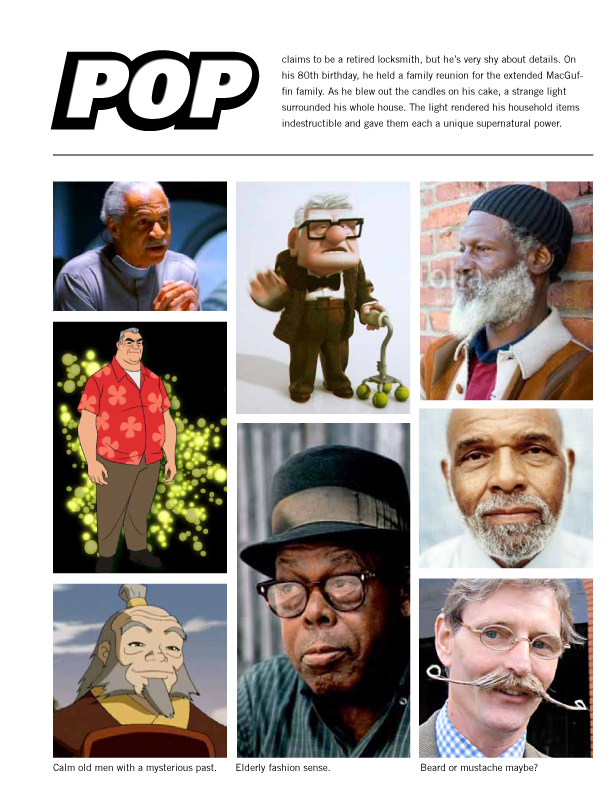
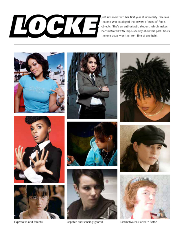
Artist Style Guide for Pop & Locke's Last Heist


As with any project where I hire an artist, I've put together an Artist's Style Guide for Pop & Locke's Last Heist. This is a document I send out to any prospective artists who will work on the project. It lays out the relevant details of the game, including characters, setting, clothes, etc.

A style guide is helpful for three reasons:

1) Gathering and organizing all this reference material forces you to clearly articulate the visual aesthetic for your game. You might have some image in your head, but you need to share that with others and looking at the same document can help.

2) Searching for this reference clues you into a handful of illustrators who you may initially contact for estimates. Even if you can't hire them, they might know others who will be a better fit.

3) Once artists are hired, they won't have to work from a blank slate. Again, using a common source of visual inspiration saves you both time once you start working together.

You can see a previous style guide I put together for Do: Pilgrims of the Flying Temple. Your style guide doesn't need to be so fancy as either of these, but a simple collection of images and text is a great way to start a working relationship with your artists.

Thursday, October 20, 2011

Prepping for the Writer's Dice Kickstarter: Part 2 - The Video


So you've heard my usual advice for making a Kickstarter video. All that still applies. Here was my strategy for this video in particular.

I was greatly inspired by Trey Parker and Matt Stone's lesson to NYU writing students in which they shared their technique for outlining a plot. In their lesson, they break out each beat so there's always a "therefore" or a "but" in between. That makes a naturally flowing sequence of events. It's a great lesson and one that fits seamlessly into the main appeal of Writer's Dice, to select the most meaningful words to connect each beat.

Normally, I'd start off a Kickstarter video as if it were a short 30sec commercial for the project. This time, I decided to neatly present that writing lesson into a cute tutorial, something like Common Craft or One-Minute Science. Megan and I brainstormed all the ways we could present this lesson: Stop-motion props? Stock art with silly voices? A sketch with actors in costume?

Finally, I settled on using the papery figures from Do: Pilgrims of the Flying Temple. You might recognize the girl with hair buns from the examples of play in the latter half of the book. I dreaded the thought of animating in Flash, though. Surely there would be an easier way to do this.

I ended up recording a screencast from Photoshop. I just moved the individual layers around as needed. I hid the mouse and cursor during the export, then I brought together those screencasts in iMovie and sped them up about 2000%... yes, literally 2000%. Essentially, I was using the same stop-motion technique as a Common Craft video, but entirely on the computer. I wrapped up the video with a description of the dice and long close-up shots of the dice prototypes.

The video is titled "How to Write the Plot for your Story" in the hopes of capturing some SEO in the last few weeks leading up to 2011's NaNoWriMo. The whole video is designed to be (hopefully) edu-taining enough to be shared on its own, thus drawing more eyeballs to the Kickstarter campaign.

Wednesday, October 19, 2011

Prepping for the Writer's Dice Kickstarter: Part 1: Pricing


In the spirit of transparency, here's the cost breakdown for the Writer's Dice. This is the kind of budgeting and planning you have to do before you launch any Kickstarter campaign.

Production Estimate
Quantity: 100
19mm, .4 oz, Opaque Square-edged Blank Dice, Red
Custom etching on each face
Each die costs $1.75, a total of $175.

Shipping (according to USPS Price List Effective June 6, 2011)
Domestic package shipping up to 3oz (~4 dice + padded envelope) costs $1.71
To Canada, it costs up to $2.24
To Mexico, it costs up to $2.86
Everywhere else, up to $3.46

Pricing Strategy
I want to charge a flat rate of $5 per die, just like the Mathematician's Dice kickstarter. That means the single-die orders are going to be the most costly for us. We'll only have about $1.50 cushion for a single-die domestic order. We'll take At least a 17¢ hit on each single-die international order.

So, we have a couple options here. First, we can just hope we'll have more domestic orders than international and that they will offset our losses. Furthermore, if we have roughly the same turnout as the Mathematician's Dice, the vast majority of our backers will order multiple dice at once. That will further offset any small losses from international orders.

Otherwise, our other option is to charge shipping for international orders. Not sure how the Mathematician's Dice kickstarter afforded not charging international shipping, but I assume they went with the strategy described above and hoped for the best. I think I will do the same. A flat rate for all orders is nice and simple for the customer.

In the Mathematician's Dice campaign, only 83 got a single die. 669 backers got two dice at $10 and 413 got four dice at $20. Assuming The MD team had the same costs as us and these were all international orders outside of North America, those single orders cost them a total of $17.43. The two-die orders got a total profit of $662.04. The four-die orders got a total profit of $3940.02. Their highest tier, $50, only got 60 orders, but each one is a massive profit that more than offset the single orders.

Now, there is a very valid argument to be made in favor of including full shipping charge in the pledge amount, so single orders would be $7. (Essentially charging $5 for each die plus $3 for the shipping.) Then we cut that price down to $10 for two dice. And so on, offering further discount deals at higher quantities. It's a totally valid structure, and one we're weighing, but we honestly just like the no-muss, no-fuss single-price, even if it doesn't explicitly encourage a higher-volume order.

In the end, we'll probably end up with a compromise clause in the single-order pledge tier: "International orders, please add $1." That would suffice to cover the additional expense and still keep our otherwise smooth pricing structure.

This doesn't even take into account the percentage cut that Kickstarter and Amazon will take from the final Kickstarter pledges. But let's set that aside for another time. :P

EDIT: And, of course, after bringing it up with Megan, she immediately came up with an elegant solution. Offer a PDF product at the $10 level to encourage a jump from one die to two. A handy little guide for incorporating Writer's Dice into games and using them in writing exercises on their own. No cost to us, but it would be just enough to spur an impulse upgrade. Nice!

EDIT 2: Okay, we figured out the expenses for the Kickstarter and Amazon cuts. Turns out we must compromise on the $5 flat price in the case of international orders. An extra buck or two for international orders should cover the extra costs.

Thursday, September 15, 2011

Star Wars as Unlockable Kickstarter Rewards [Guest Post: Kevin Allen Jr]


Kevin Allen Jr. just posted this on Google Plus, in response to this week's Kickstarter-centric posts. It's all so good I just wanted to share it with you all:


+Daniel Solis has been talking a lot about kickstarter on his blog lately, and he's had my wrapt attention. His most recent post (linked below), gave me a nifty idea.

See I skimmed the title of his blog post in my RSS reader and got an idea of what he was going to talk about but i was WAAAAAY off. (NOTE: What he actually talks about is useful and interesting to anyone who's thinking of launching a kickstarter. I'm not going to talk about that. I'm going to talk about what i thought he was talking about.)

Examining the reward titles/levels Solis whipped up, I got the idea that depending on how far over goal your kickstarter goes you would "unlock" new parts of a games (or other transmedia project's) meta-fiction.

For example: Lets say you were making a game that essentially re-created the experience of the Star Wars saga.

- At 100% success the game play emulates A New Hope. The game is totally complete, and we don't need any more to have a satisfying experience. You play the game, blow up the deathstar, kiss your sister and a wookie gets the last word.

- At 200% success The Empire Strikes Back is brought into play, the game provides ways to incorporate that films darker tone, cloud city, lando, degobah, etc. But it leaves you with a bit of a cliffhanger/mysterious ending.

-Only if the project is funded 300% do benefactors unlock The Return of the Jedi parts of the game. This rounds out the experience, delivers on promises and threats put forward in the first two levels of the game. People will want to get here. You want people to want to get here.

There's a motivation for backers to put more money in after the initial goal has been reached, because now the project they've already invested in will be even richer. Also by adjusting the scope of work to the overflow of funding you will actively be showing people where their additional monies are going (pro tip: people like that).

Wednesday, September 14, 2011

Using Game Fiction in Unlockable Kickstarter Rewards


Now, about that $100 price point in yesterday's post. Board games are expensive to produce in small volumes. By being clear that these are rare, boutique prototypes, I hope that price for a physical copy is a little less painful. There is a way around this, though. If the campaign is extraordinarily successful, we could produce prototypes more affordably and pass the savings to the backers.

200%: The Fleet Raids the Fringes of the Empire. $45 backers get the benefits of the Free Citizen reward level. Any backers $50 or over get a digital bundle of the game's raw production files.

300%: The Fleet Leads a Revolution on the Core Worlds. $40 backers get the benefits of the Free Citizen reward level. Any backers $50 or over get a digital bundle of the game's raw production files. This also unlocks a video demonstration of the game.

400%: The Fleet Conquers the Imperial Capital. $35 backers get the benefits of the Free Citizen reward level. Any backers $50 or over will get a digital bundle of the game's raw production files and a video demonstration of the game. The highest backer will also get 20 hours of Daniel Solis' time to do art direction, layout and branding consultation for one project. (Details to be negotiated.)

As you can see, the unlocked rewards here aren't necessarily more expensive to offer. The digital files would already be made for production, so making them available to backers costs nothing extra except maybe bandwidth. The video demo costs time to produce, but also gives an opportunity to show off a good prototype. And that offer of 20 hours? You can do that too if you have some special skills you can offer to one lucky backer.

As you set your own milestones, it never hurts to be optimistic. Want to go as high as 500%, 600%, even 1000%? Go right ahead! Just make sure the unlocked rewards are affordable for you to offer to that many people.

» Photo: CC BY-NC-SA Miguel Villasis

Tuesday, September 13, 2011

Name Recognition and Personal Investment in Kickstarter Reward Levels


I'm taking my own advice in a little thought-experiment. Based on consultation with the card game price gurus, I thought FOR THE FLEET might be better suited as a traditional board game with chits, boards and dice. I could use Kickstarter to fund the production of boutique prototypes to demo at conventions and ship to interested company prospects. By current specs, the prototype would include

6 Ship Consoles
6 Ship Pawns
18 Sector Cards
36 Target Cards
1 Home Base Card
1 Imperial Capital Card
54 Crew Chits
27 Bio Chits
27 Pep Chits
27 Fuel Chits
27 Tech Chits
27 Meme Chits
54 Glory Chits
6 Dice
I've advised people to use your actual printed space as an opportunity for limited rewards for Kickstarter backers. That real estate is limited and valuable. It costs nothing extra to print a credit on a board, card or chit, but it means a lot to your most excited community members. Even if you're just printing a book, you could offer small bylines on each page for each sponsor. "This page sponsored by Firstname Lastname." With that in mind, here is how name recognition could be used in FOR THE FLEET's reward structure.

Imperial Drone: $1. All backers are listed in the game's credits on the rule sheet.

Rebel Sympathizer: $10. You will get a print-and-play PDF version of the game, complete with kickass papercraft starship miniatures.

Rations for the Fleet: $20. [27] This pledge provides nutrigel, vitaloaf, and coffee for the rebellion. You can name one of the Bio Resources in the game. Your chosen name is listed on one of the Bio chits. Plus, you will get the PDF version of the game.

Energy for the Fleet: $30. [27] This pledge provides dark matter, compost, and other exotic fuels for the rebellion. You can name one of the Fuel Resources in the game. Your chosen name is listed on one of the Fuel chits. Plus, you will get the PDF version of the game.

Hardware for the Fleet: $40. [27] This pledge provides hull patches, computers and duct tape for the rebellion. You can name one of the Tech Resources in the game. Your chosen name is listed on one of the Tech chits. Plus, you will get the PDF version of the game.

Luxury Items for the Fleet: $50. [27] This pledge provides comics, saucy holo-vids, and adequately sized helmets for the rebellion. You can name one of the Pep Resources in the game. Your chosen name is listed on one of the Pep chits. Plus, you will get the PDF version of the game.

Dangerous Ideas for the Fleet: $60 [27] This pledge provides secret Imperial plans, ancient alien knowledge, and addictive cat videos for the rebellion. You can name one of the Meme Resources in the game. Your chosen name is listed on one of the Meme chits. Plus, you will get the PDF version of the game.

Rebels for the Fleet: $70. [38] This pledge provides wave after wave of crew members for the rebellion. You can name one of the crew members. Your chosen name is listed on one of the Crew chits. Plus, you will get the PDF version of the game.

Free Citizen: $100. You will get a rare, first-run prototype of the game made specially for you by the designer, plus a PDF version. The first ten [10] backers at this level will also get to name one of the crew. [International Orders: Please add $20]

Imperial Overseer: $200. [36] You can name a planet. Your name is listed on its card with the title of Overseer. You will also get a rare first-run prototype of the game plus a PDF version. [International Orders: Please add $20]

Imperial Sector Host: $300. [18] You can name a Sector. Your name is listed on its card with the title of Sector Host. You will also get a rare first-run prototype of the game plus a PDF version. [International Orders: Please add $20]

Fleet Captain: $400. [6] You can name a rebel ship. Your name is listed on the ship's console with the title of Captain. You will also get a rare first-run prototype of the game plus a PDF version. [International Orders: Please add $20]

Rebel Leader: $1000. [1] You can name the rebel's home base. Your name is also listed on its card with the title Rebel Leader. Throughout the game text, any mention of the Rebel Leader will use your name. You will also get a rare first-run prototype of the game plus a PDF version. Your prototype will be signed and numbered by the designer. [International Orders: Please add $20]

Galactic Emperor: $1000. [1] You can name the Imperial Capital planet. Your name is also listed on its card with the title Galactic Emperor. Throughout the game text, any mention of the Galactic Emperor will use your name. You will also get a rare first-run prototype of the game plus a PDF version. Your prototype will be signed and numbered by the designer. [International Orders: Please add $20]

Each of these rewards gives the backer a sense of identity within the game's setting. This helps instill a sense of ownership in the fiction. You can easily do this for books by naming characters after backers. In a game, you can name example players after backers, too.

Tomorrow, I'll talk about how you can use the game's fiction in a different way, to structure the unlockable rewards.

» Photo: CC-BY-SA Kai Schreiber

Monday, September 12, 2011

Maintaining Kickstarter Momentum after 100%


Sebastian Hickey asks for some Phase 2 crowdfunding advice:

"I used your Kickstarter project as a template for my effort, so apologies for stealing some of your ideas. I hit my funding goal really early, but now I don't know what to do with the project. Do I leave it there, sitting idle, or is there anything I can do to get more funders?"

Congratulations on hitting your goal! That begins Phase 2 of your campaign. Now, look at your production cost estimates and see where you can get volume discounts. Then you can start offering high tier benefits to backers of a lower tier. For those who already backed at a high tier, offer additional low-cost or no-cost benefits like PDFs and other digital goodies.

For example, when Do's campaign started, we only offered books to those who pledged $40. After we we passed ~150% funding, we started offering books to $30 backers, too. After the next milestone at ~200%, we offered books to $25 backers, too. So the $40 didn't feel like they were cheated, we offered them exclusive print editions of the first Do expansion and PDFs.

It's good to plan those milestones before the campaign starts, so newcomers aren't confused about what they're actually getting when they pledge.

Another thing you can do is start sending free product to charities once certain milestones are reached. Make sure those milestones give you enough profit to cover the loss of that free product.

For example, in Happy Birthday Robot's campaign, I sent free copies of the game to schools and libraries of backers' choice. This not only built good will with the game's target audience, but kept the urge to pledge active for the life of the campaign.

Just remember, this is one of several phases in the average Kickstarter life cycle. There may still be unexpected costs once your campaign is over. Keeping up the momentum and encouraging more pledges gives you enough cushion should anything go wrong in production or shipping.