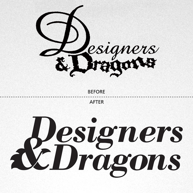
 Evil Hat Productions just announced that they'll be re-publishing Designers & Dragons, Shannon Appelcline's epic history of the role-playing game industry and community. They're going to expand the book into four volumes, each volume focusing on the events of on decade from the 70s through the 00s. Fred Hicks asked me to revise the masthead and create a system of icons representative of each decade of gaming.
MASTHEAD
This one was tough because we didn't want to stray too far into WotC's official branding and we needed to communicate "designers" as much as "dragons." The usual solution would have been to make each word a different font, as the original title had done. I explored that solution at first, just to get it out of my system, but as you can see from the design process below, we eventually landed on a more refined typographic solution. The slides below are actual pages from the design docs I sent to Fred.
Round 1
"Essentially the same idea as the original Designers & Dragons masthead, but much more refined. This update pairs the very contemporary Gotham with classic D&D font Fritz Quadrata. The ampersand fuses with the second D to become a smaller mark.
Or maybe you want to go full Fritz Quadrata...
...or all Gotham.
Perhaps something a little more formal and unified, if a little prudish. Trajan being a very stalwart “title font” for damn near everything, but particularly apropos on a history book.
Jenson has a slightly more aged, humanist feel.
Maybe we can try a very high-design approach here, pairing Bodoni and Carton, with a Bodoni italic ampersand lying firmly outside the rectangle. The organic curves of that ampersand make it a natural place for a light touch of the draconica, without going full-on TSR with it."
Round 2
"Continuing with the exploration of various Bodoni styles for “Designers” and arranging the various elements. Also using Diavlo for “Dragons”
Maybe lowercase? It seems a little too busy and the swoops compete with Diavlo.
Two-tone to distinguish each half of the title?
Or go all the same? Probably room for a middle-ground. Also not sure if the Bodoni Italic is holding up well in this phase. Might need to choose another font.
Maybe make the whole thing Diavlo? The lowercase g’s would be right on top of each other, so I converted an uppercase G to be small caps. Hopefully it’s not too noticeable.
That’s definitely holding up better than Bodoni. What do you think?"
Round 3
"This time around, we’re equalizing the priority of “Designers” and “Dragons.” As noted in the last round, these are odd words to stack at equal weight because of the matching descenders in the g’s. Moving the ampersand down to the second line might help nudge the words off-center so they’re less crowded.
For the sake of curiosity, let’s try the title using the same typeface as the original ampersand font: Bodoni Bold Italic (&). Very classy and respectable. If we go this direction, I would recommend not adding a bunch of superfluous textures. A white title on a cover could be a slightly more professional direction.
For example...
Thoughts?"
Well, Fred liked it! So we proceeded to the icon design.
ICONS
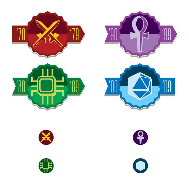
Each volume focuses on a different decade of gaming, each with distinctive events that changed the nature of the industry. The 70s were the origin of RPGs as we know them, led by the earliest editions of Dungeons & Dragons. The 80s were the industry's adolescence and Cyberpunk was the flavor du jour. The 90s saw the rise of Vampire: The Masquerade and Magic: The Gathering, we decided to focus on Vampire. And in the 00s, the d20 license encouraged dozens of small studios to release their own products.
Round 4
"We’re going with this as the masthead, so let’s look at some icon options. These will be used in full-color online and on marketing materials. Smaller black-and-white dingbats will be used in in-line text. I focused on one icon for each decade – 70s: Sword, 80s: Chip, 90s: Ankh, 00s: d20.
The “fancy: icon suite in black-and-white: The icons remain flat, but have a few touches to suggest dimension. The type is subtle, but clear. The background arrows flow into each other, capped at the beginning and end with flat sides.
Color versions of the “fancy” icon. Tried to keep them generally monochromatic, but keeping the same shade qualities throughout.
The smaller dingbat versions of the icons in color and black and white. The interior details of each icon have been removed, along with the banners and text. The spokes of the circuit had to be slightly extended so they were clearly visible. The d20 doesn’t hold up as well in this treatment, ending up looking either like a hex or a cube (which are still related to gaming, but not specifically to this decade).
Cover and Spine Mockups."
Round 5
The changes from here on were mostly cosmetic, hence the repeated captions.
Round 6
Adding a handful of circular dingbats to the suite.
And you can see the final results at the top of this post! Hope you dig them. You can find out more about the books and follow their development at the Designers & Dragons product page!


No comments:
Post a Comment